The "Sales" tab provides an in-depth look at your overall sales and conversion metrics. This data you can help you gain insights into your shop's financial health, identify trends, and make data-driven decisions to improve your sales strategy.
Table Of Contents
- Sales Performance Metrics
- Shop Conversion Funnel
- Sales Over Time
- Orders Over Time
- Orders By Source
- Order Map
- Top Sales Traffic Areas
Sales Performance Metrics
In the "Sales Performance" tab, you'll find various metrics that provide a comprehensive view of your shop's sales performance. These metrics include total sales, total orders, total earnings, average order value, returns, and return rate. By monitoring these metrics, you can track your shop's financial performance and identify areas where you need to make adjustments.
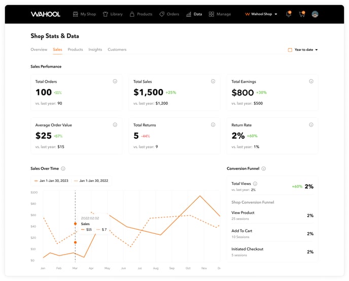
Let's quickly review each of these metrics:
-
Total Orders: This metric represents the total number of orders placed by customers on your e-commerce shop during a specific time period. Knowing your total orders can help you understand how much demand there is for your products, and how that demand changes over time. It can also help you identify which products are the most popular and adjust your inventory and pricing accordingly.
-
Total Sales: Total sales is the total amount of revenue generated by your e-commerce shop during a specific time period. This metric is important because it tells you how much money your business is making. By tracking your total sales over time, you can identify trends in customer behavior and sales patterns, and adjust your marketing and sales strategies accordingly.
-
Total Earnings: This metric represents the total amount of profit your e-commerce shop has earned during a specific time period. It takes into account the total sales minus the cost of goods sold (COGS), as well as any other expenses such as shipping and handling fees, transaction fees, and marketing costs. Knowing your total earnings can help you understand the profitability of your business and make informed decisions about pricing, inventory, and marketing.
-
Average Order Value: Average Order Value (AOV) is the average amount of money spent by customers per order on your e-commerce shop during a specific time period. This metric is important because it helps you understand how much your customers are willing to spend on your products, and how you can encourage them to spend more. By tracking your AOV, you can identify opportunities to upsell or bundle products, and offer incentives like free shipping or discounts for larger orders.
-
Total Returns: Total Returns represents the total number of orders that have been returned by customers during a specific time period. Returns can be costly for e-commerce businesses, as they often involve additional shipping and handling fees, restocking costs, and lost revenue from cancelled orders. By tracking your total returns, you can identify which products are most likely to be returned and why, and adjust your marketing and sales strategies accordingly.
-
Return Rate: Return Rate is the percentage of orders that have been returned by customers during a specific time period. This metric is important because it tells you how satisfied your customers are with your products and services. High return rates can be a sign that there are issues with product quality, shipping times, or customer service, and may require you to make changes to your business processes to improve customer satisfaction and reduce returns.
Overall, the Sales Performance section provides you with valuable insights into your shop's financial performance and helps you make data-driven decisions to optimize your sales strategy. So, be sure to review this section regularly and use the data presented to drive more sales and grow your business.
Pro Tip
By reviewing the data presented in the "Sales Performance" tab regularly, you can identify areas where you need to focus your efforts to drive more sales. For example, if you notice a low average order value, you may need to adjust your pricing strategy or offer promotions to incentivize customers to purchase more. Alternatively, if you notice a high return rate, you may need to review your product descriptions and ensure that customers have accurate expectations before making a purchase.
Shop Conversion Funnel
Shop conversion is a way to measure how many people who visit your online shop actually end up buying something. If your shop has a high conversion rate, it means that a lot of people who visit your shop end up making a purchase. But if your shop has a low conversion rate, it means that many people who visit your shop leave without buying anything.
By monitoring your shop's conversion rate, you can find out if there are any issues with your shop that may be stopping people from buying things. For example, if your conversion rate is low, it could be because your shop is hard to use, or your prices are too high.
The average e-commerce conversion rate across all industries is around 1.4%, while the top-performing websites can achieve a conversion rate of up to 11%. However, as a general guideline, a good e-commerce conversion rate can be considered to be between 2% and 5%.
It's calculated by dividing the total number of purchases by the total number of visitors and multiplying the result by 100 to get a percentage. For example, if your shop receives 100 visitors and 2 of them make a purchase, your conversion rate would be 2% (2/100 x 100).
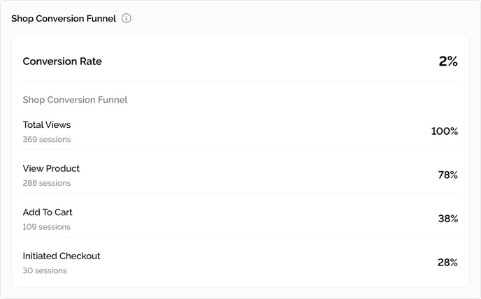
The Funnel Explained
The shop conversion funnel is a series of steps that a website visitor takes on their path to making a purchase. Our funnel is broken down into several stages, which are "Shop Visitors," "View Product," "Add to Cart," and "Initiated Checkout."
Let's quickly break these down and discuss why these are important
-
Shop Visitors: Shop visitors are the total number of people who have visited your online store. It's the first step in the customer journey, and it's an important metric because it tells you how many people are aware of your brand and interested in your products. By monitoring this metric, you can track the effectiveness of your marketing efforts in driving traffic to your store. If you notice a decline in shop visitors, it may be an indication that you need to adjust your marketing strategy to increase awareness of your brand.
-
View Product: "View Product" is a metric that tracks the total number of times a product page has been viewed by a potential customer. This metric provides insight into the overall interest in the products offered by the shop. By monitoring this metric, the shop owner can get an idea of how many people are interested in their products and which products are generating the most interest
-
Add to Cart: "Add to Cart" is a metric that tracks the number of times a customer has added any product to their shopping cart. It's an important metric because it tells you how many potential sales were created by customers adding items to their cart. By monitoring this metric, you can get a better understanding of how many customers are interested in purchasing your products and how your website is performing in converting those interests into sales. If you notice that a lot of items are being added to carts but not purchased, it may indicate that there are issues with your website's user experience or checkout process that need to be addressed to improve conversion rate
-
Initiated Checkout: "Initiated Checkout" is a metric that tracks the number of times a customer has started the checkout process. It's an important metric because it tells you how close customers are to making a purchase. By monitoring this metric, you can identify potential roadblocks in the checkout process and address them before customers abandon their cart. If you notice that many customers are initiating checkout but not completing their purchase, it may be an indication that the checkout process is too complicated or that shipping costs are too high.
Each stage represents a milestone in your customers' purchase journey, with the ultimate goal being to get them to complete a purchase. By tracking the number of visitors who progress through each stage of the funnel, you can get a better understanding of where your website is losing potential customers and taking steps to improve those areas.
How They Are Calculated
In terms of how these metrics are calculated, each step of the funnel is based on the number of sessions that occur on your website. A session is a period of time where a user is actively engaged on your website. For example, if someone visits your website and then leaves for 30 minutes before returning to continue shopping, that would count as two separate sessions.
The calculation for each step of the funnel is based on the number of sessions that took that particular action. For instance, in the example given, there were 369 sessions under "Total Views". To calculate the percentage of people who proceeded to view a product, we would divide the total sessions under "View Product", which is 288, by the total number of sessions under "Total Views". Thus, 288/369 = 78% conversion rate.
Overall, tracking the shop conversion funnel and its associated metrics is important because it allows you to identify areas of your website where visitors are dropping off and take action to improve those areas. By optimizing your website to improve the user experience and increase the likelihood of a purchase, you can ultimately increase your sales and grow your business.
Pro Tip
To improve your shop's conversion rate, there are several strategies you can consider. As a shop owner, you can optimize your product images and descriptions to make them more appealing and informative to potential customers. This can help increase the likelihood that visitors will make a purchase. You can also offer promotions or discounts to encourage visitors to complete their purchase, such as free shipping or a percentage off their order.
Additionally, you can use the data provided in the sales performance metrics section of the data dashboard to identify areas where their shop may be underperforming and take action to improve those areas. For instance, if you notice your conversion rate is lower than average, you may want to focus on improving your product descriptions or offering more promotions to encourage visitors to complete their purchase.
Sales Over Time
"Sales over time" is a term used to describe the number of sales made by a business over a specific period, such as a day, a week, a month, or a year. By tracking sales over time, businesses can identify trends, patterns, and changes in their sales performance. This information can then be used to refine sales strategies and improve overall revenue.
Sales over time are typically visualized using a line graph, which shows two lines: one representing the dates and another representing the sales amount during that period. This visualization helps businesses compare sales over time and identify patterns.
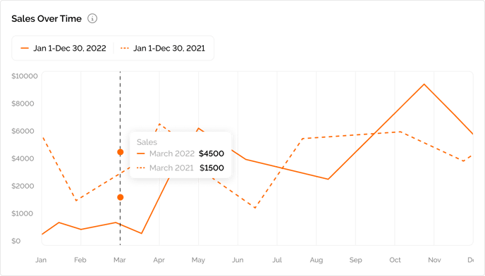
The "Sales over Time" graph is a visual representation of the amount of revenue generated by an online store or platform over a specific period of time. It is a valuable tool for e-commerce businesses to track and analyze their sales performance, identify trends and patterns in customer behavior, and make informed decisions about future business strategies.
To read the graph, you can start by looking at the X-axis, which represents time. The time period could be days, weeks, months, or years, depending on the scale of the graph. The Y-axis represents the amount of sales during that time period, usually in units of currency, such as dollars or euros.
One important aspect of the Sales over Time graph is that it shows two lines - one for the current date period and one for the previous period. This allows you to compare the sales performance of their store between two different periods and draw insights from the comparison.
By looking at the graph, you can easily identify trends in your sales performance. For instance, you may notice that your sales are increasing steadily over time, or that they are fluctuating seasonally. You can also identify spikes or dips in sales, which could be the result of promotions, seasonal trends, or changes in your product line.
Overall, the Sales over Time graph is an essential tool for online you to track and analyze your sales performance, identify trends and patterns in customer behavior, and make informed decisions about future business strategies.
Pro Tip
Tracking sales over time might reveal that your shop experiences a surge in sales during the holiday season. This information can be used to develop special promotions or marketing campaigns to take advantage of this trend and increase sales further. To draw insights from the sales over time graph, you may want to ask yourself questions like:
-
What factors contributed to spikes or dips in sales?
-
How can I replicate the factors that led to the spikes in sales?
-
Are there any trends in my sales performance that suggest the need for changes in my business strategy
On the other hand, if sales are consistently low during a particular time of year, you can analyze the reasons for this and adjust your strategies accordingly to improve sales during that period. Overall, tracking sales over time is a crucial tool for businesses to identify trends and optimize their sales strategies.
Lastly, comparing the two lines on the Sales over Time graph can provide additional insights into your business performance. For example, if the current line is consistently above the comparison line, it may indicate that your business is growing and generating more revenue compared to the previous period. Conversely, if the current line is consistently below the comparison line, it may indicate that your business is underperforming and generating less revenue compared to the previous period.
Using the Sales over time graph, you can analyze your sales data and also identify areas for improvement. For example, if you notice a decline in sales over a certain period, you may investigate potential reasons for this decrease and take corrective action to improve their sales performance. Alternatively, if you see a significant increase in sales over a specific period of time, you may conclude that a recent marketing campaign was successful in driving sales and looking for ways to replicate that success in the future.
Orders Over Time
"Orders over time" is a term used in e-commerce to refer to the number of orders placed by customers on a particular online store or platform over a specific period of time. This metric is used to track and analyze the volume of customer purchases on the platform and to identify trends and patterns in customer behavior.
The "Orders over time" graph is a chart that shows how many people have been buying things from an online store over a certain period of time. The graph has two parts: the horizontal line across the bottom shows the time period (for example, one month or one year) and the vertical line up the side shows how many orders were placed during that time period.
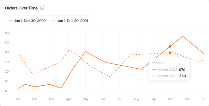
Our graph shows two lines one that represents the current date period and one that represents the previous date period. To understand the graph, the you can look at the line on the graph. If the line is going up, it means that more and more people are buying things from the store over time. If the line is staying the same or going down, it means that fewer people are buying things from the store.
You can also compare the "Orders over time" graph to other things happening in the store, like advertising or new products, to see if those things are making more people buy things. You also use the graph to plan for the future by guessing how many people might buy things in the next few months based on the trend of the line.
When analyzing the "Orders over time" graph, it is helpful to compare the current period to a previous period in order to understand how your business is performing over time. This is why there are two lines on the graph - one representing the current period and another representing the comparison period.
Pro Tip
By analyzing the number of orders over time, you can gain insights into your sales performance and determine how well your products are resonating with your target market. It can also help your determine the effectiveness of your marketing and advertising efforts and identify areas for improvement in your sales strategies.
For example, if you sees a significant increase in orders over a specific period of time, you may conclude that a recent marketing campaign was successful in driving sales. Alternatively, if you notice a decline in orders over a certain period, you may want to investigate potential reasons for this decrease and take corrective action to improve your sales performance
Additionally, by comparing the two lines against each other, you can identify trends and patterns in order volume and determine if your current strategies are performing better or worse than those in the comparison period. For example, if the current line is consistently above the comparison line, it may indicate that your business is growing and attracting more customers compared to the previous period. On the other hand, if the current line is consistently below the comparison line, it may indicate that your business is losing customers or failing to attract new ones.
By understanding how your current strategies compare to those in the comparison period, you can make informed decisions to improve your business performance. For example, if you notice that your business is performing worse than the comparison period, you may want to investigate the cause and make changes to your strategies to improve order volume. Conversely, if you notice that your business is performing better than the comparison period, you may want to identify what is working well and try to replicate it in the future.
Orders By Source
"Orders by source" refers to the breakdown of the different channels or sources that generate orders on your Wahool Shop. Each source of traffic can be attributed to different marketing efforts, such as direct traffic (people who type your website URL directly into their browser), social media (people visiting your shop through your social media profiles), email (people clicking on links in your emails), search (people finding your shop through search engine results), and other sources. By tracking orders by traffic source, you can identify the most effective marketing channels and optimize your marketing campaigns for better performance.
Pro Tip
By tracking orders by traffic source, you can identify which sources are generating the most orders, which ones are underperforming, and adjust your marketing strategies accordingly. This information can be useful for optimizing your marketing campaigns and improving the overall performance of your shop. By tracking orders by traffic source, you can identify the most effective marketing channels and optimize your marketing campaigns for better performance.
Some helpful insights to consider
-
Identify the most effective marketing channels: By tracking orders by traffic source, you can determine which marketing channels are generating the most orders for your shop. This information can help you focus your marketing efforts and allocate your marketing budget more effectively. For example, if social media is generating the most orders for your shop, you might want to invest more in social media marketing campaigns.
-
Optimize your marketing campaigns: Tracking orders by traffic source can also help you optimize your marketing campaigns. For example, if paid search generates a lot of traffic but not many orders, you might want to revisit your ad targeting or ad copy to improve conversion rates.
-
Improve customer acquisition: By identifying which traffic sources are underperforming, you can take steps to improve your customer acquisition efforts. For example, if the "Other" source is generating very few orders, you might want to investigate where that traffic is coming from and adjust your marketing efforts accordingly. Alternatively, if email marketing is underperforming, you could try improving your email campaigns or segmenting your email list to target specific groups of customers more effectively.
Order Map
Orders by location refer to the number of orders placed through your Wahool shop, grouped by the geographical location of the buyer. This data shows you which states or countries your customers are located in and can help you identify popular regions where your products are in high demand or where you may need to improve your shipping or delivery logistics.
The heat map displays traffic density in different shades - darker shades mean more sales and lighter shades mean less sales. This data can help you identify which regions of the United States are most interested in your products. This data can help you identify which regions of the United States are purchasing your products.
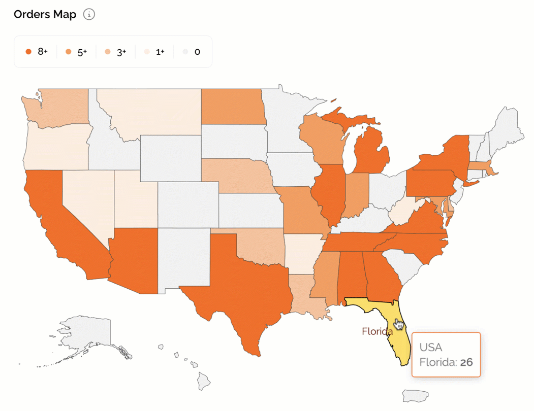
To make use of this data, you can analyze which regions or states have the highest number of orders and adjust your business strategy accordingly. For example, you may offer special promotions or discounts for customers in certain regions to increase sales. This information can also be useful for targeting specific regions for marketing or advertising campaigns to increase brand awareness and attract more customers.
Pro Tip
Use the Orders by Location data to improve your marketing efforts. Consider running location-based marketing campaigns or offering special promotions for customers in regions with high order volumes. This can help increase sales and customer loyalty.
By analyzing the number of orders by location, you can identify regions or states with the highest number of orders. This information can be used to prioritize your marketing efforts and sales strategy to target those regions.
For example, if your Orders Map shows a high number of orders from California, you may want to run targeted Facebook ads to customers in California or offer a promotion specifically for California residents. This can help you increase sales and improve customer retention in those high demand regions
Top Sales Areas By Location
Knowing the top sales areas by location is important for a shop owner because it provides insights into the geographic regions where their shop is most successful. This data can help the shop owner to optimize their marketing efforts and tailor their product offerings to better meet the needs and preferences of customers in these regions. For example, if a shop owner sees that a particular city has a high number of sales, they may want to consider running targeted marketing campaigns or offering promotions specific to that city.
Additionally, identifying top sales areas can help a shop owner to make informed decisions about where to expand their business in the future. For instance, if a shop owner notices that there is a high demand for their products in a particular region, they may consider opening a physical storefront or warehouse in that area to better serve their customers and increase sales.
Overall, understanding top sales areas by location can provide valuable insights into a shop's customer base and help the shop owner to make data-driven decisions to grow their business.
Pro Tip
he Top Sales Area by Location report provides valuable insights into which regions or states are generating the most sales for your shop. By analyzing this data, you can adjust your sales and marketing strategy to target those areas more effectively. For example, you may want to run targeted Facebook or Instagram ads to customers in those regions, offer promotions or discounts to incentivize repeat purchases, or even partner with local influencers or bloggers to promote your products to their audience.